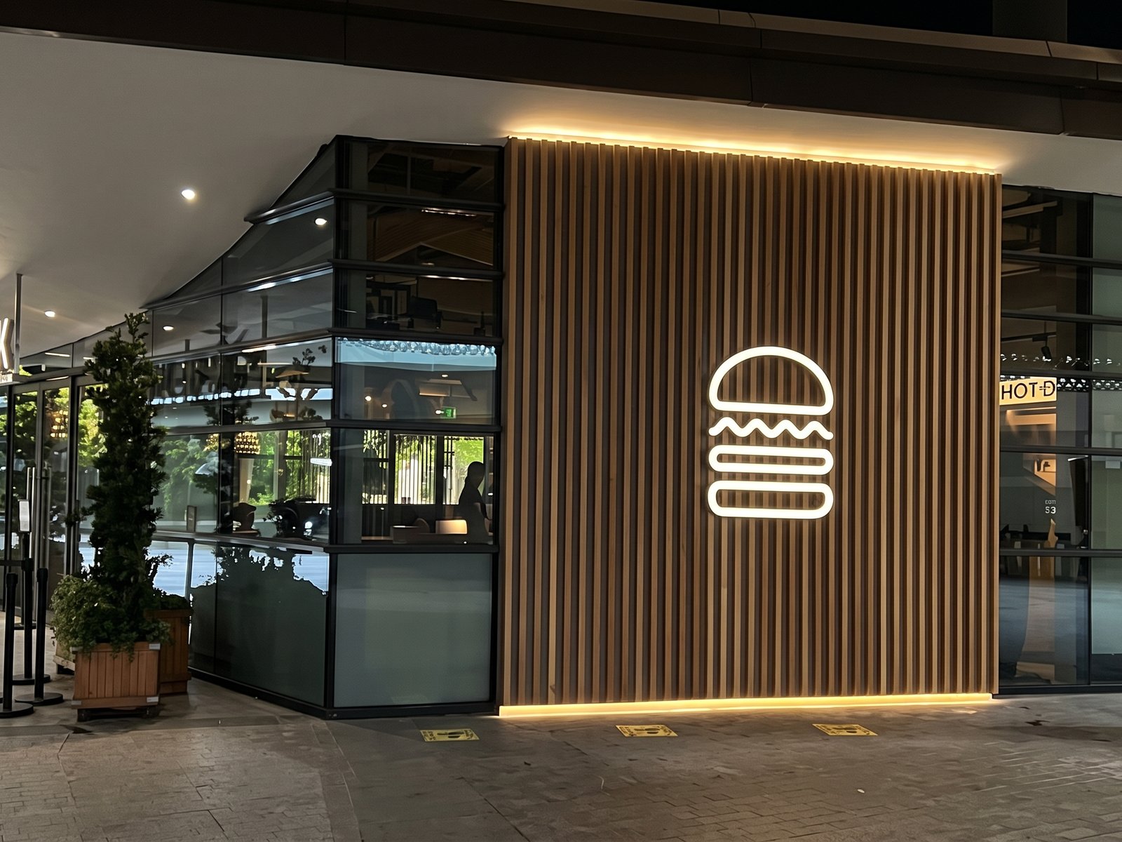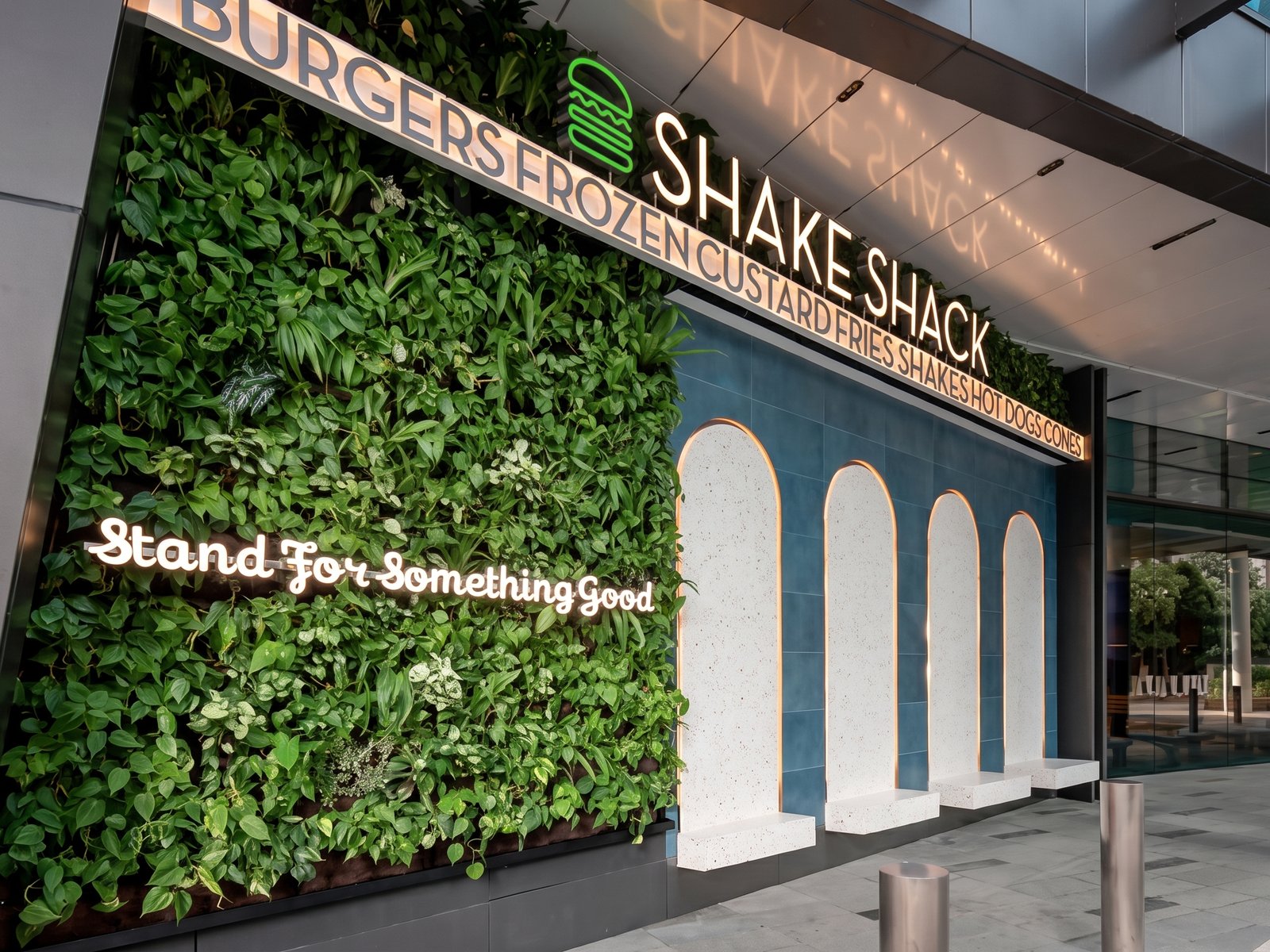
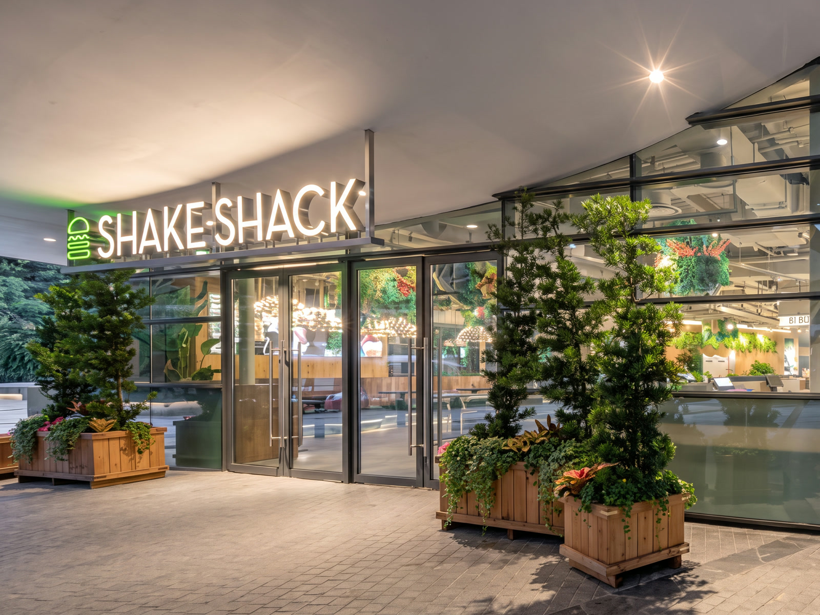
Shake Shack’s Singapore outlets don’t rely on one sign — the brand is layered through the space. This package covered three very different builds: the ceiling-suspended front-lit sign that names the store, an illuminated icon wall of backlit burger tiles, and freeform script lettering mounted into a living green wall.
Each element demands a different trade — suspended front-lit work, lightbox fabrication and shaped lettering — and all three came out of the same Bedok floor. That is the point of a one-workshop package: one set of shop drawings, one install schedule, and brand colours that match across every element because the same hands sprayed them.