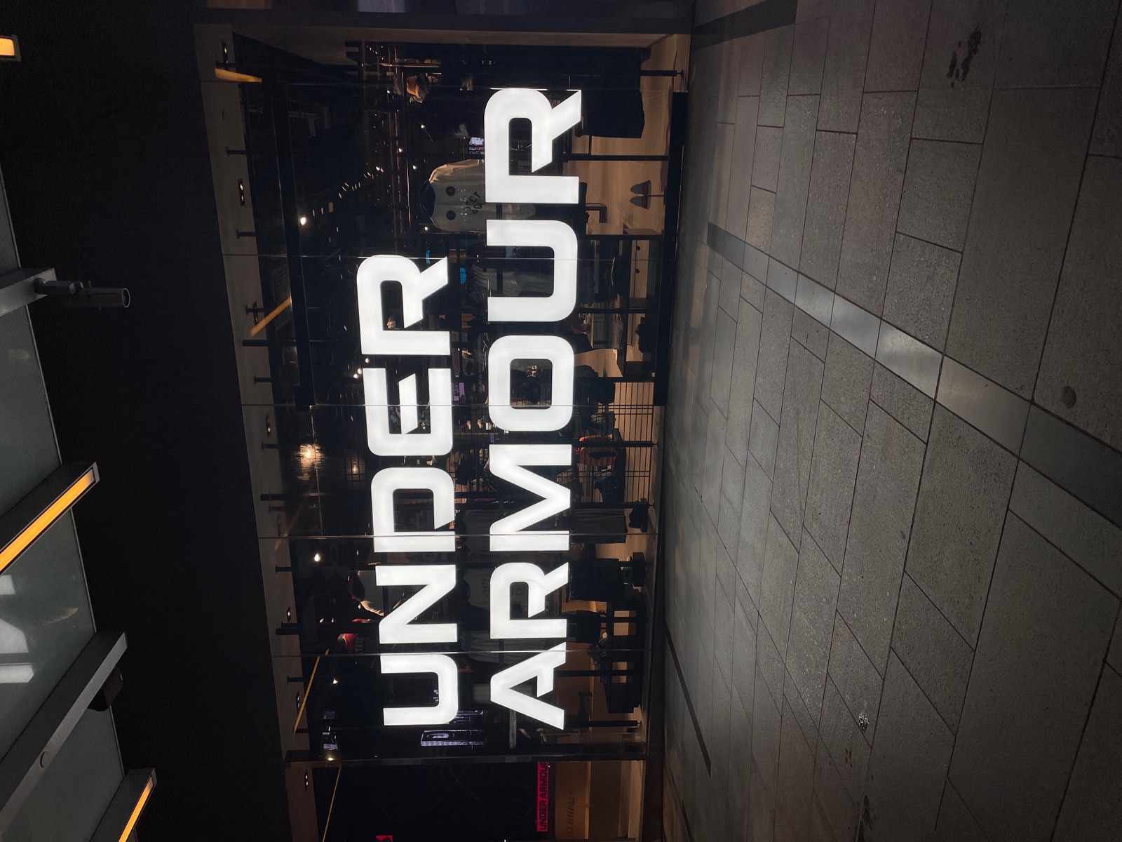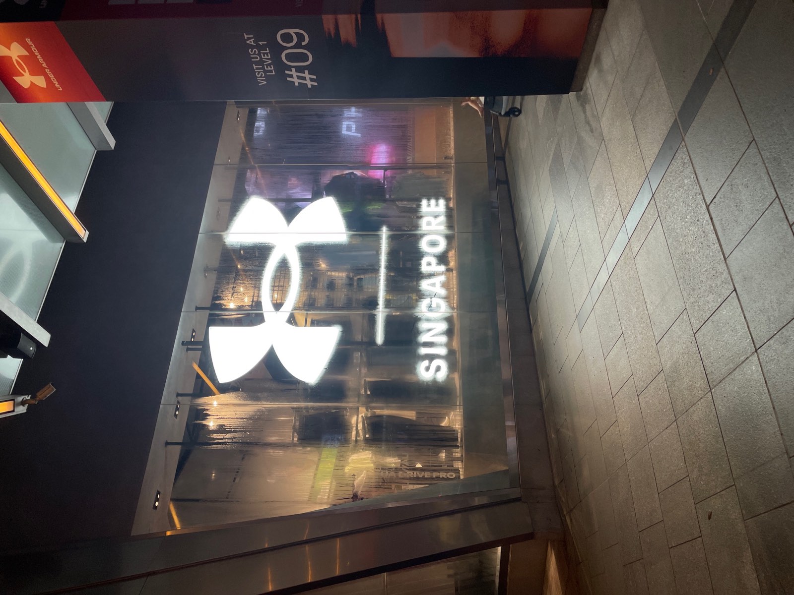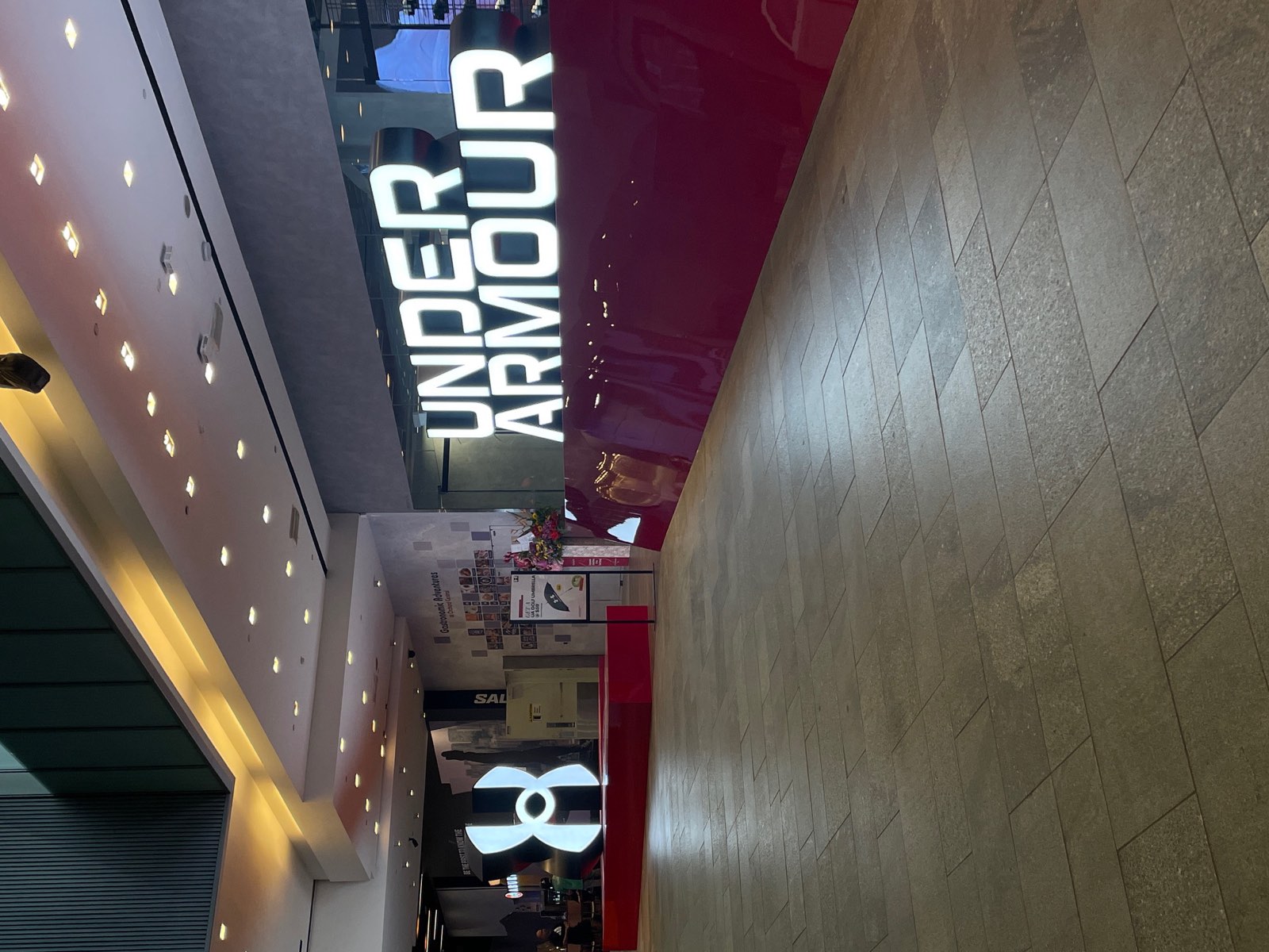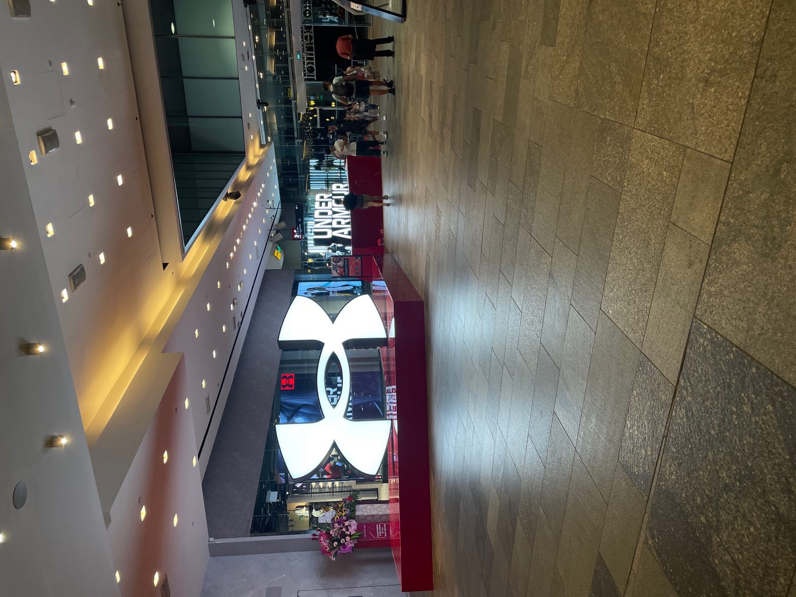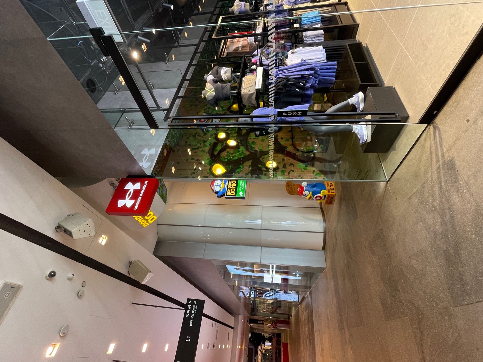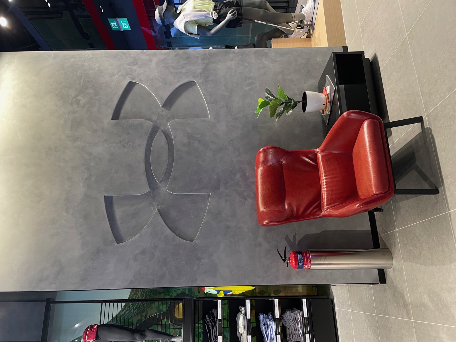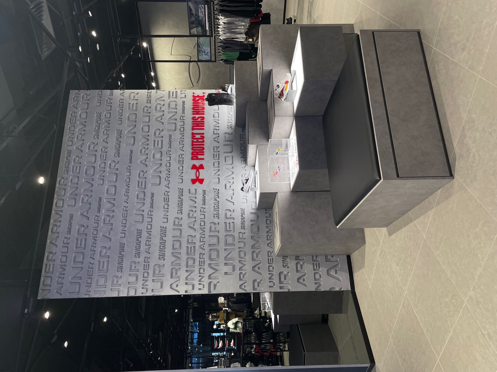
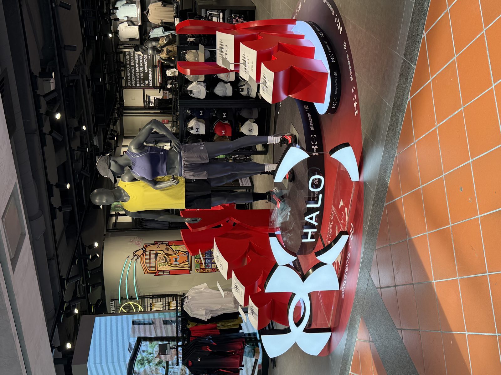
This wasn’t one sign — it was the whole store. Outside: UNDER ARMOUR in dimensional front-lit letters over the entrance, the interlocked U-A icon lit on the dark facade with the SINGAPORE lockup. Inside: lit lettering over the shop floor, front-lit icons along the walls, the logo cut as a relief into the fitting suite, and a printed brand-manifesto wall running behind the counter.
Under Armour’s mark is heavy, geometric and unforgiving — any waver in the curve of the interlocked U-A reads instantly, and here it repeats in metal, light, relief and print, so every version had to match. That is what one workshop buys: one set of shop drawings, LED modules assembled and wired in-house, colours sprayed by the same hands, and one install crew through the whole fit-out. Like every lighted sign we build, it carries a one-year warranty.